
Put the research and people in context.
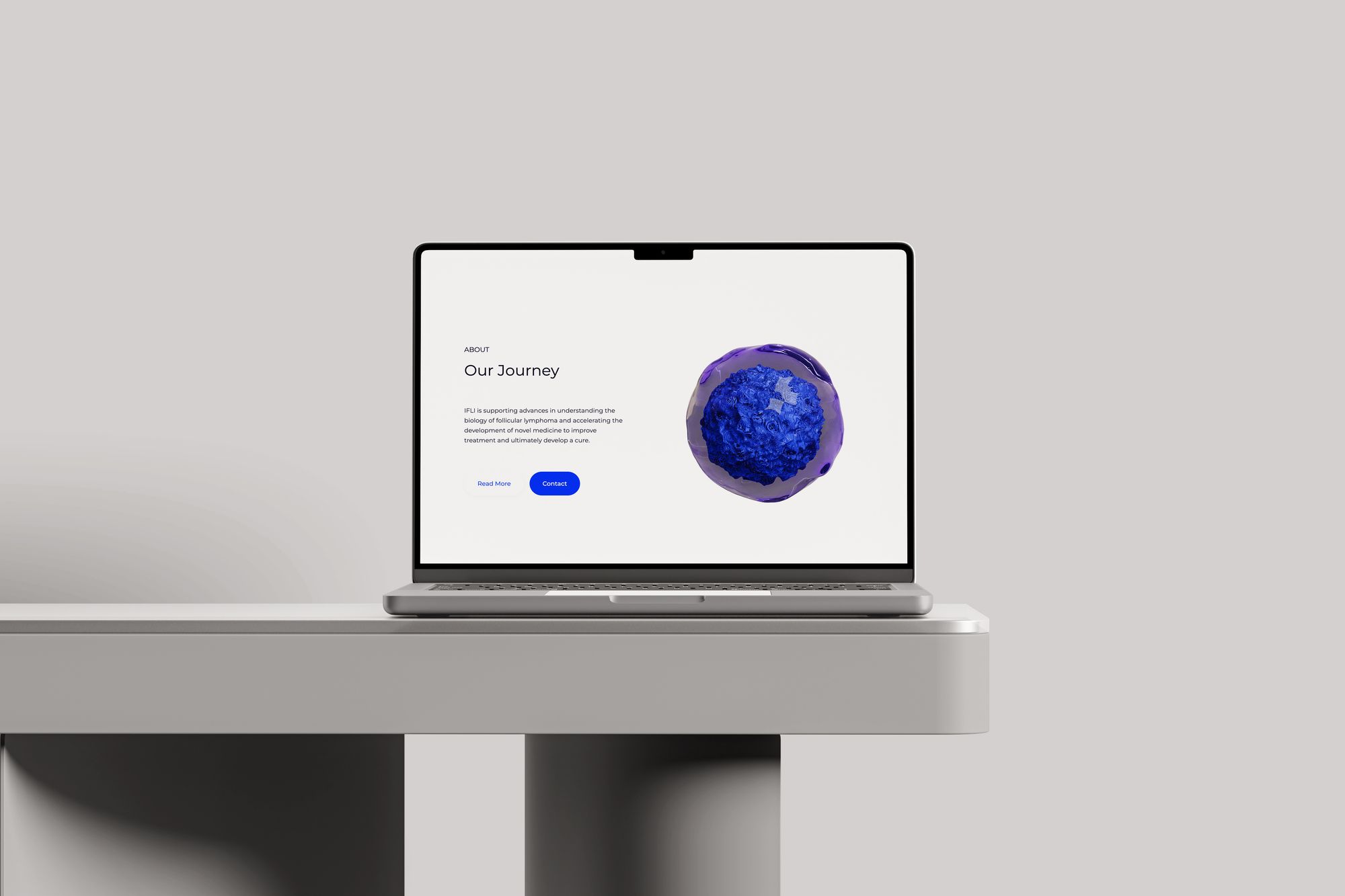
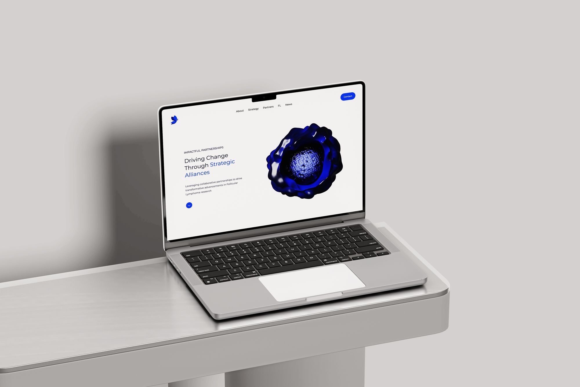
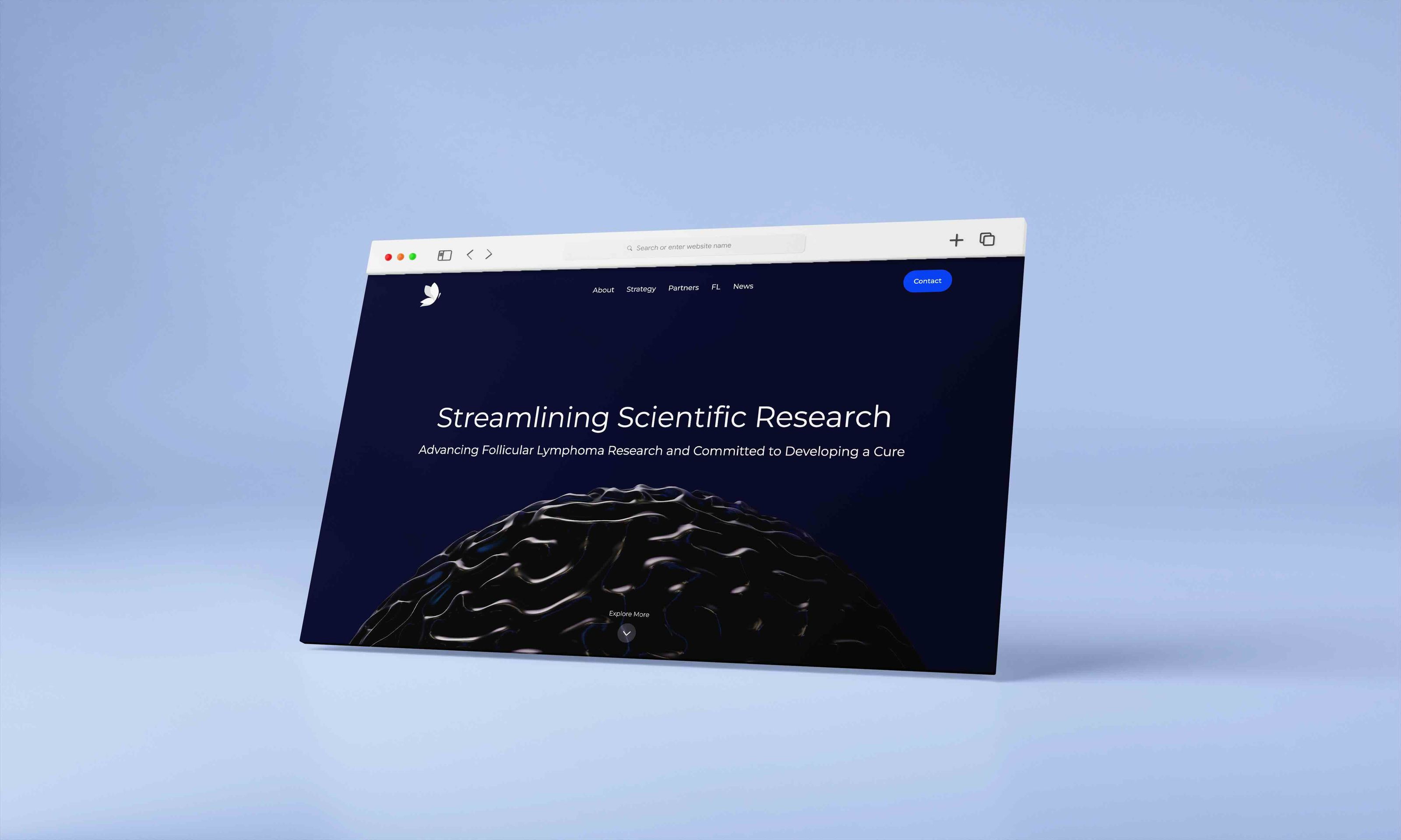
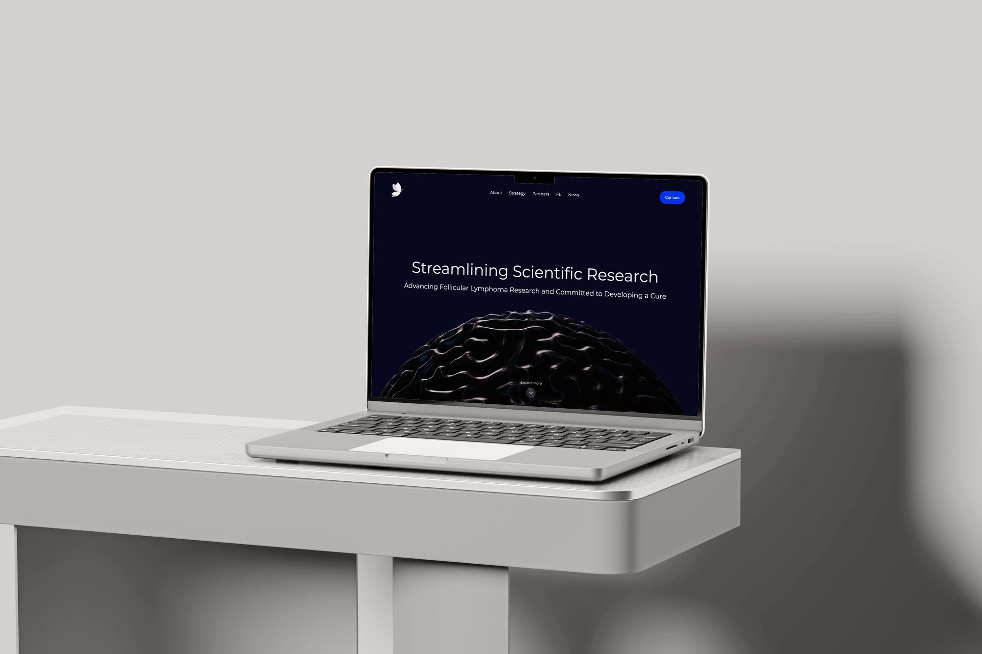
The website needed to explain what the institute was working on and who was involved. I organised the experience around its mission, research strategy, team, partners and updates.
The homepage introduces research priorities before the team and publications. Strategy content is split into distinct initiatives, giving each topic its own space without putting every explanation on screen at once.
Develop the identity alongside the website.
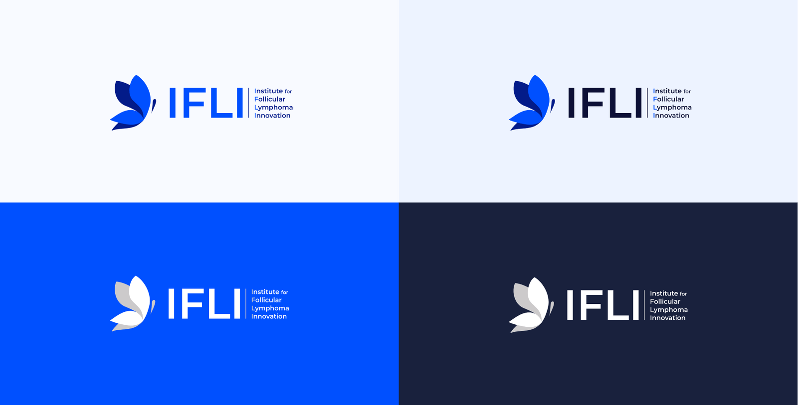
My scope included brand strategy, identity development and graphic design as well as the website. The butterfly mark, blue palette and supporting graphics were developed across digital and branded applications.
The project artwork shows how that identity carries from the website into logo treatments, social presentation and environmental mockups.
Make navigation match the first release.
During the March 2024 review, only the homepage was live. We worked through how the menu should behave on smaller screens when its destinations were sections of that page, with additional pages to follow later.
The review also covered imagery disappearing at smaller widths, consistent spacing and button details. Responsive behaviour was part of the implementation work, alongside the visual design.
Work through the team-directory details.
The directory separates the IFLI team, Scientific Advisors and SMEs. Profiles bring together a person’s role, institution and location, rather than relying on a portrait alone.
Our review covered where the list should begin after changing filters, what happens at the end of a long list and which profiles were ready to include. Link checks and content approval were part of the same review.