
Start with what a member needs to know.
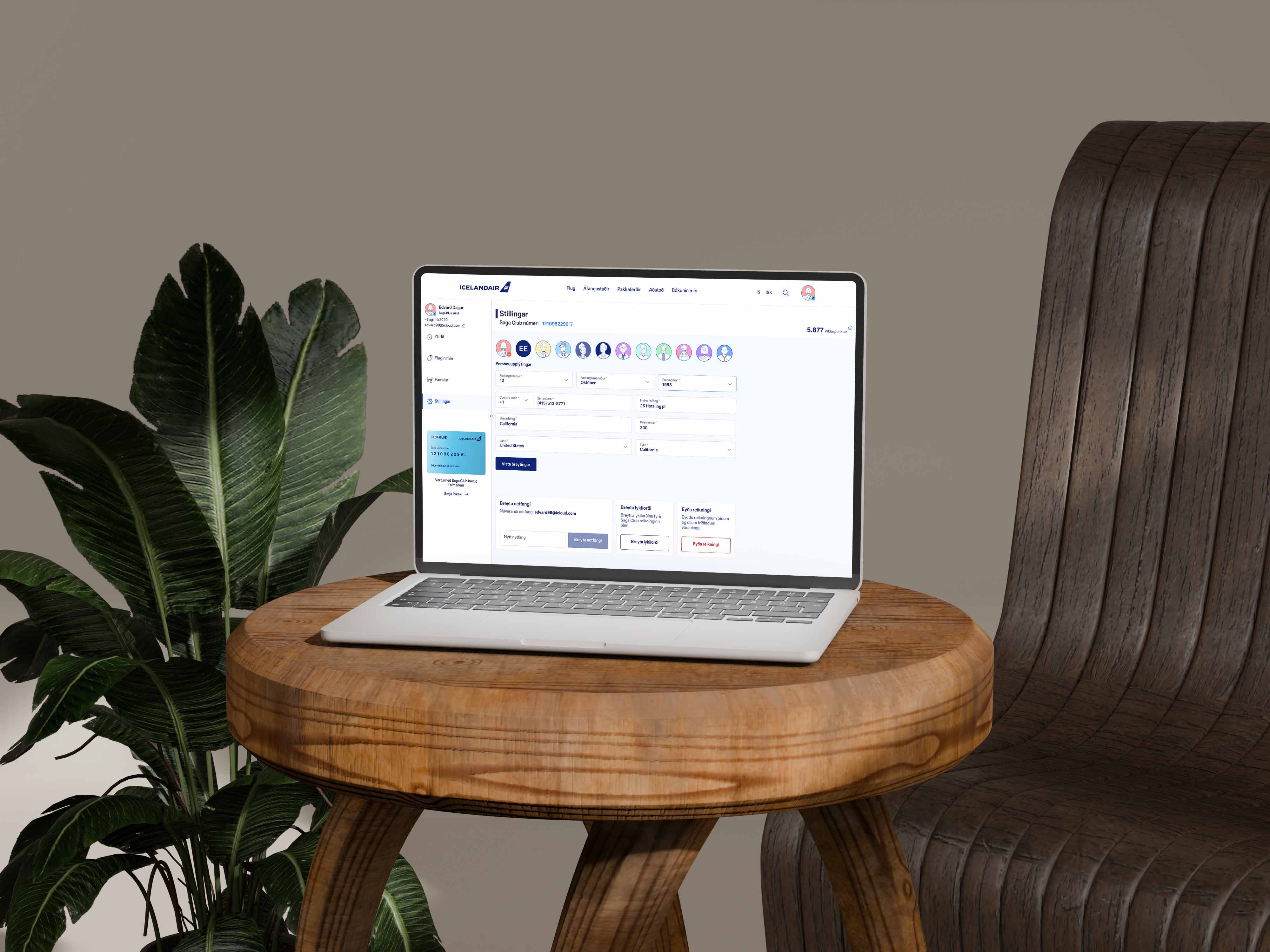
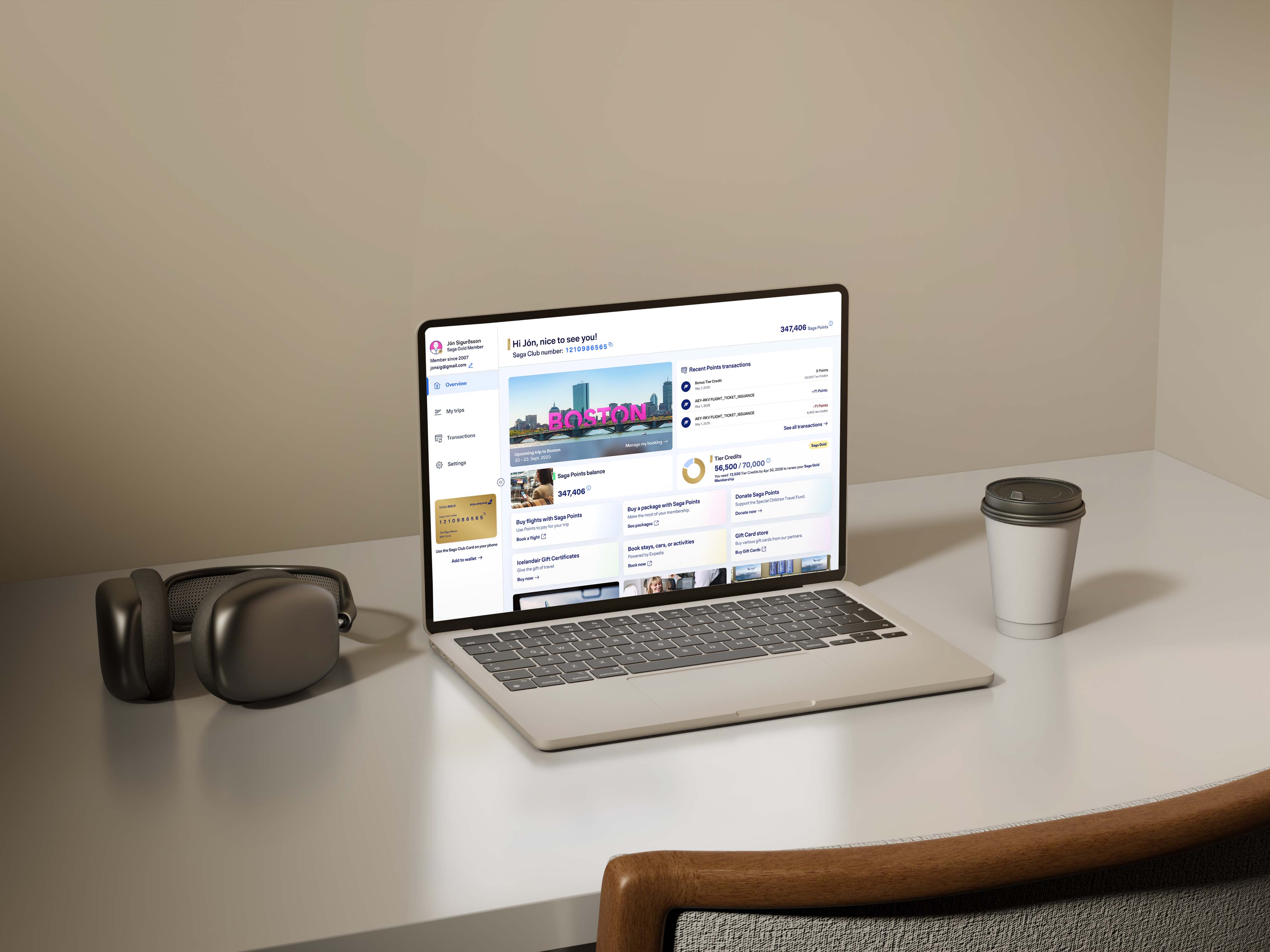
The account had to bring together membership details, points, benefits and travel. I organised it around an overview, with separate destinations for profile, trips and activity.
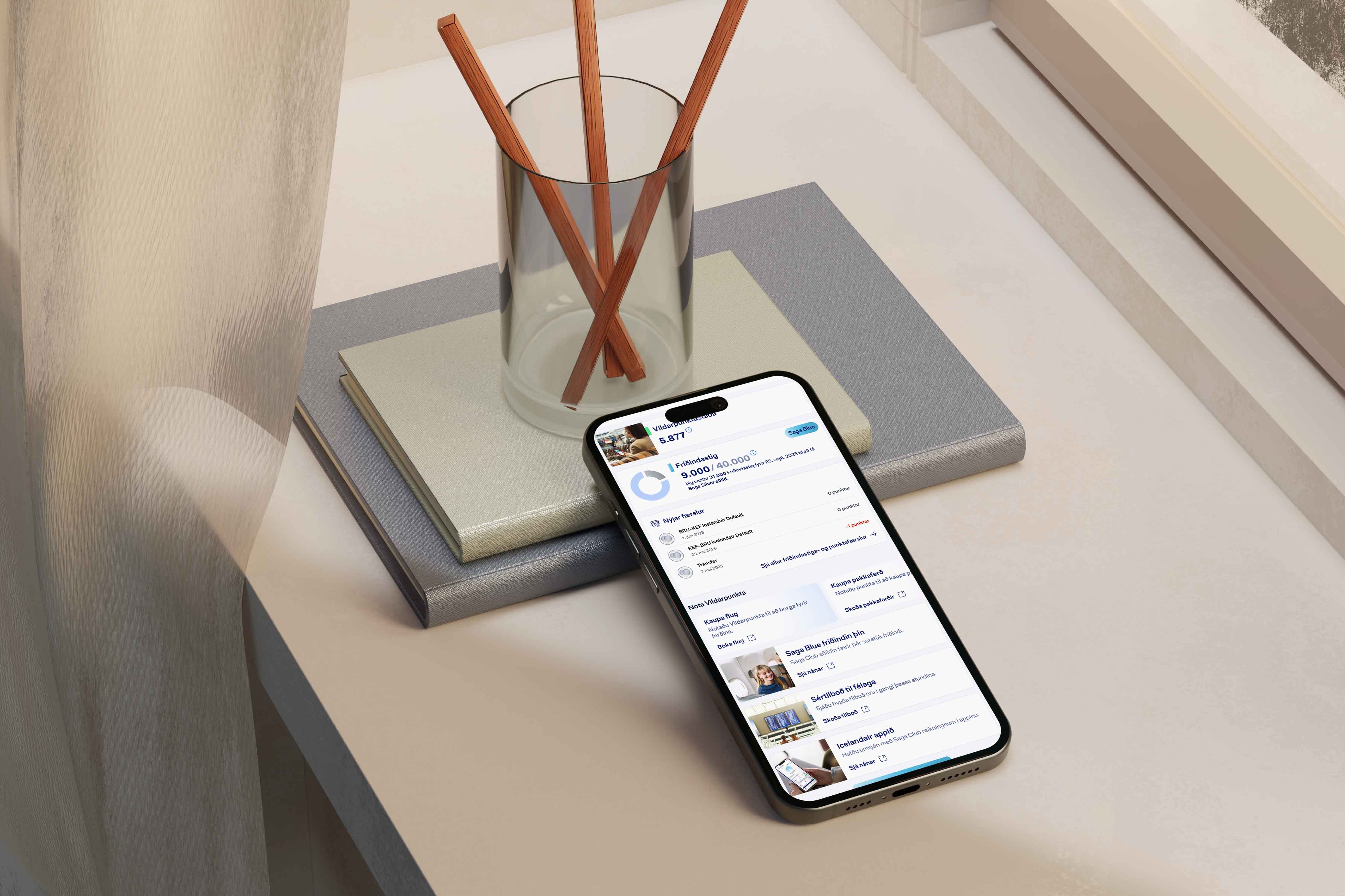
In the wireframes, points and membership information sit alongside ways to use points. Account maintenance has its own place, so changing a password does not compete with checking a balance or finding a trip.
Two balances with different purposes.
Saga Points can be spent. Tier Credits count towards membership status. Showing both as a single balance would hide an important difference.
The detailed overview separates the points balance from tier progress. The activity view also distinguishes earned Saga Points, used Saga Points and earned Tier Credits, so members can see what changed and which balance it affected.
Give trips and activity their own space.
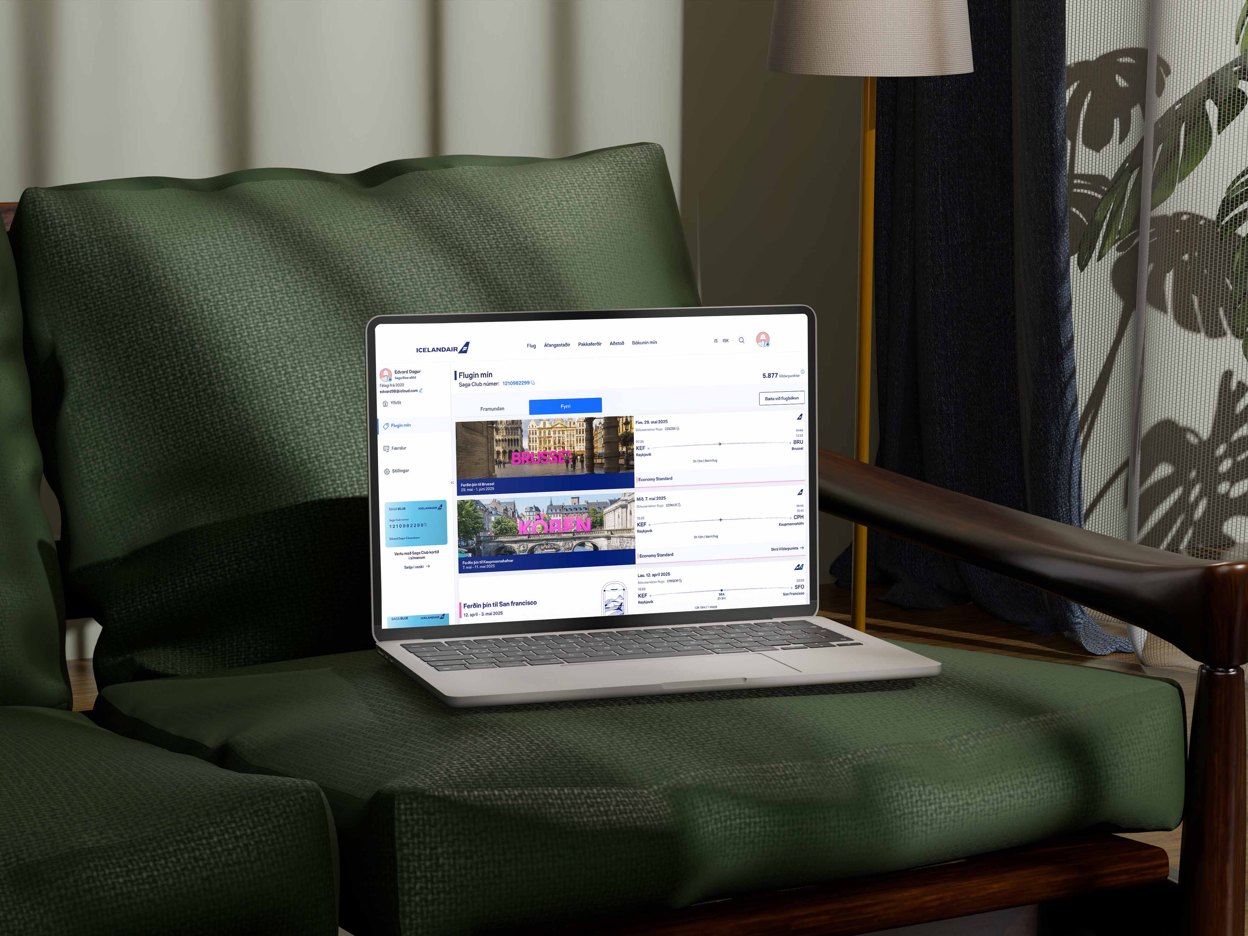
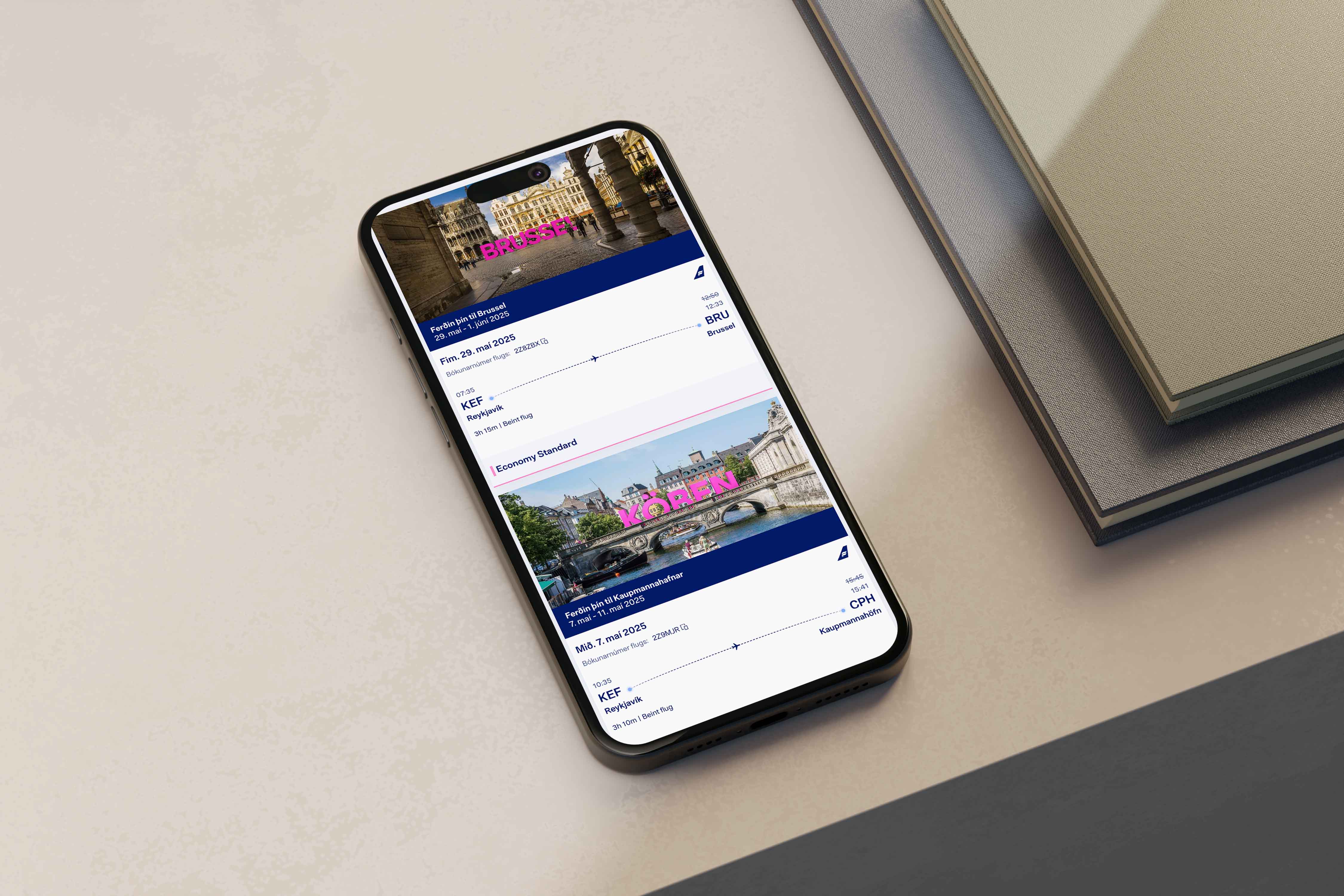
The trip screens separate upcoming and past travel, with booking details and actions such as managing a booking. Activity uses a transaction table with filters and a route to register missing points.
These are different tasks, so I gave each its own view while keeping the same account navigation. Members can move between them without leaving the account structure.
Carry the structure into the detailed design.
I developed reusable components in Figma for the account screens. Navigation, cards, tables and controls follow shared patterns across the overview, profile, trips and activity.
The work moved from an account wireframe through detailed screen design and into a beta implementation, documented in the project retrospective.