
The Challenge
The existing booking engine was outdated and caused high abandonment. Users struggled to:
- Compare outbound and inbound flights in a logical way
- Keep track of selected flights while browsing options
- Understand fare families and inclusions
- Review a clear summary before checkout
The Solution
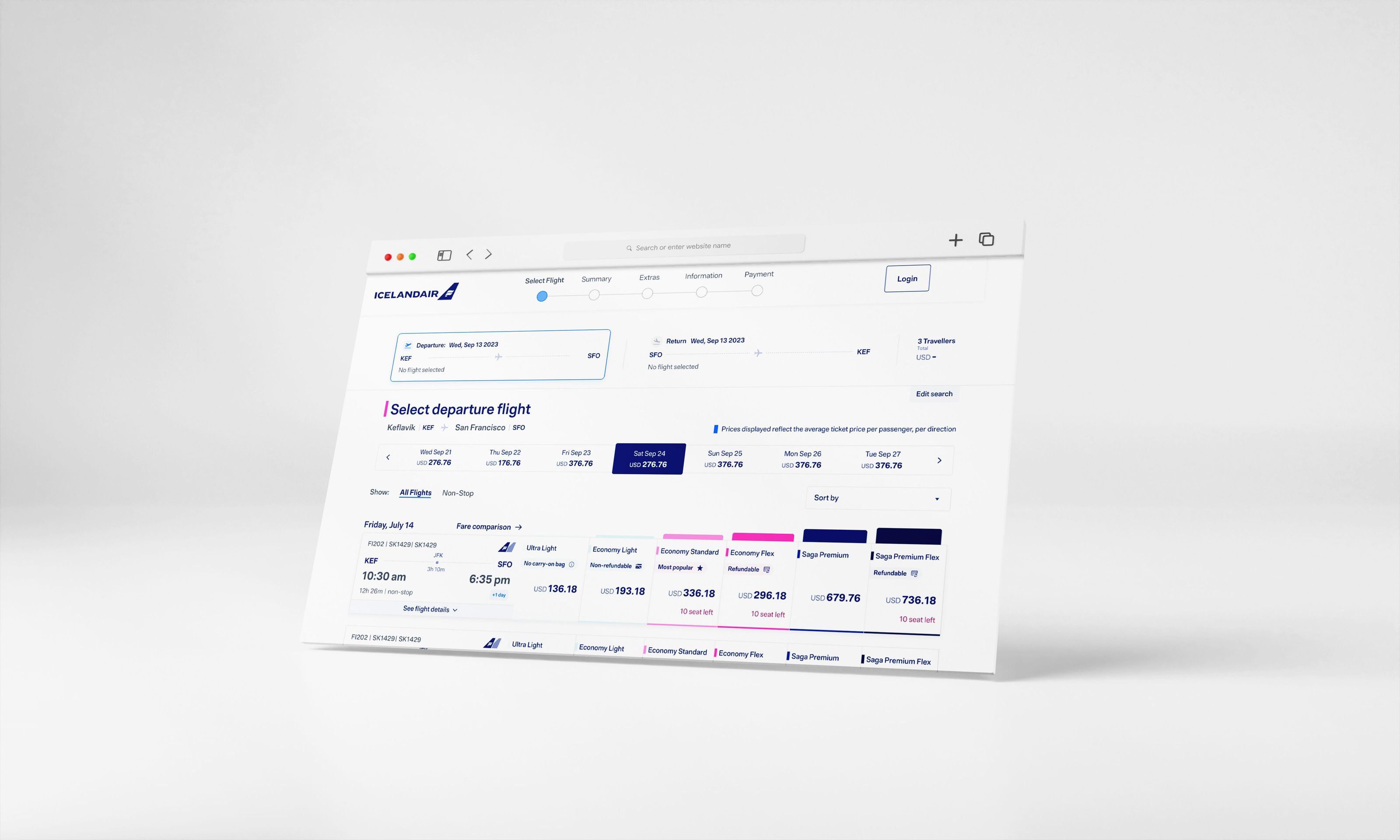
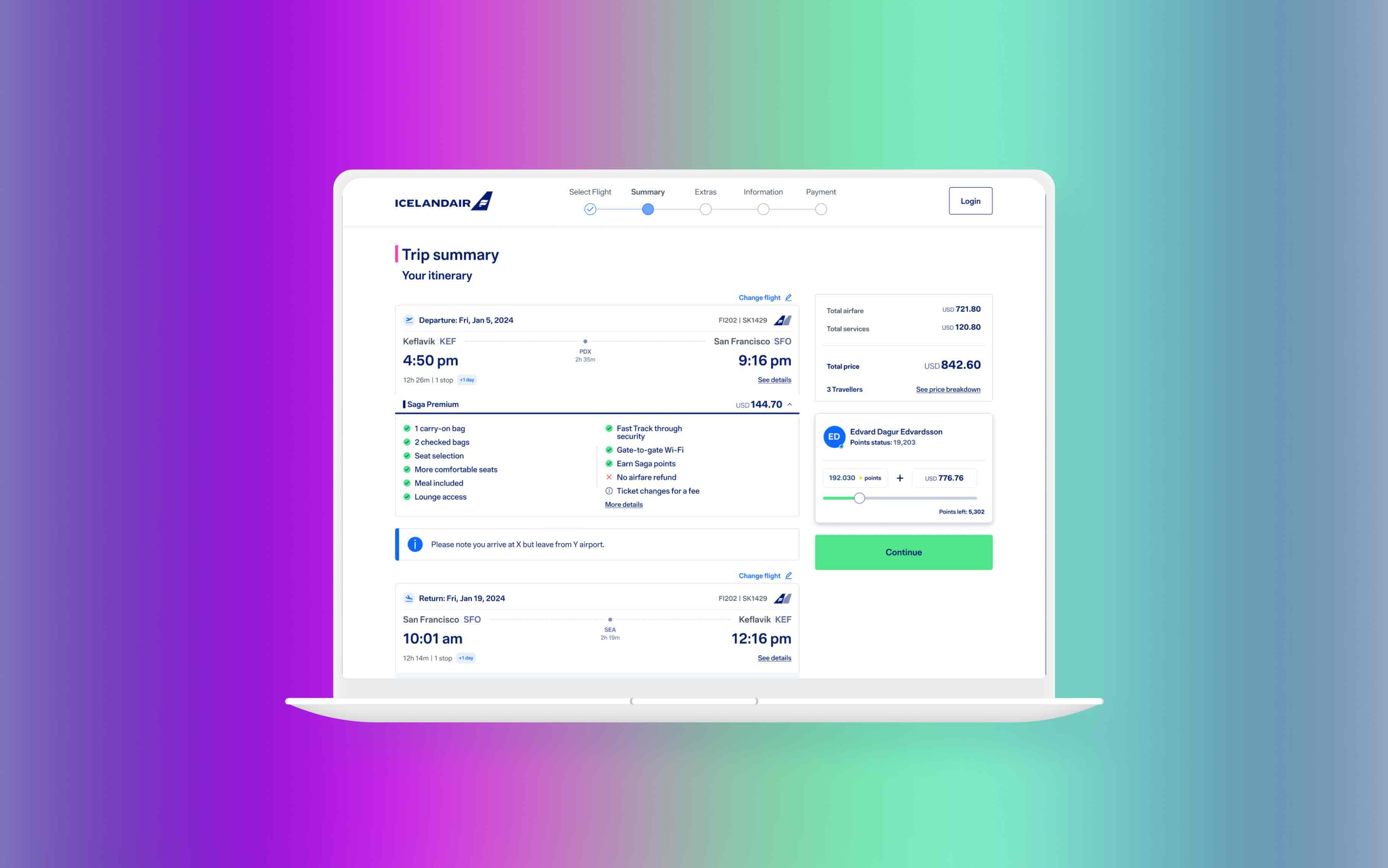
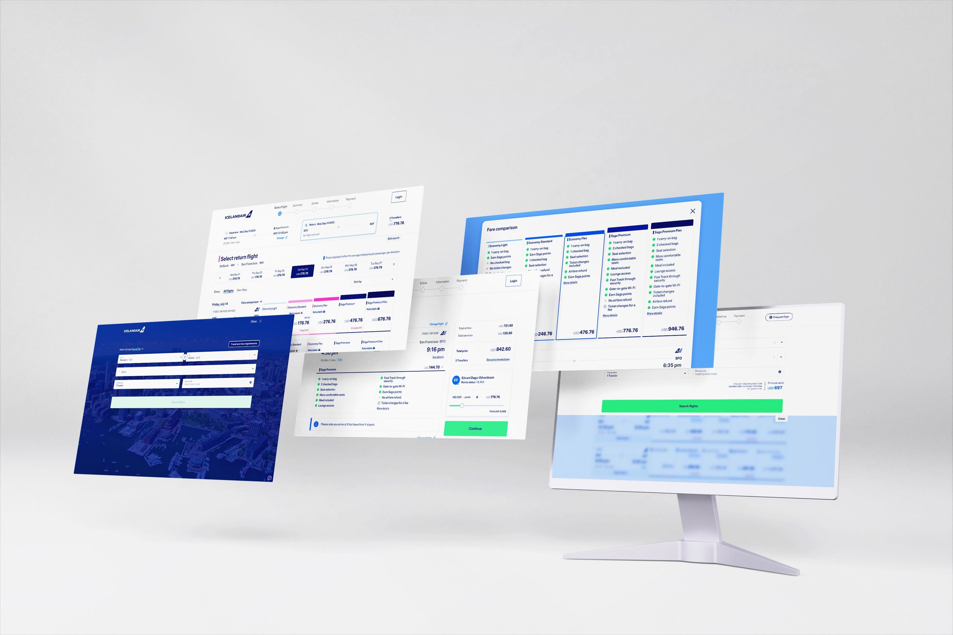
I redesigned the core flow up to the trip summary page, introducing:
- Horizontal flight selection view — outbound and inbound flights side by side
- Always-visible overview panel — keep selected flights in view at all times
- Fare family comparison module — clearer inclusions and benefits
- Trip summary page — transparent pricing and upgrade options before checkout
These improvements made the process feel more intuitive and trustworthy, especially on mobile.
Research & Process
- User interviews with frequent travelers to uncover pain points
- Usability testing on the old system to identify drop-offs
- Competitor analysis of multiple airline booking engines
- Wireframing & prototyping tested new layouts with travelers
- Visual design & documentation for handoff to the broader product team