
Keeping the origin visible
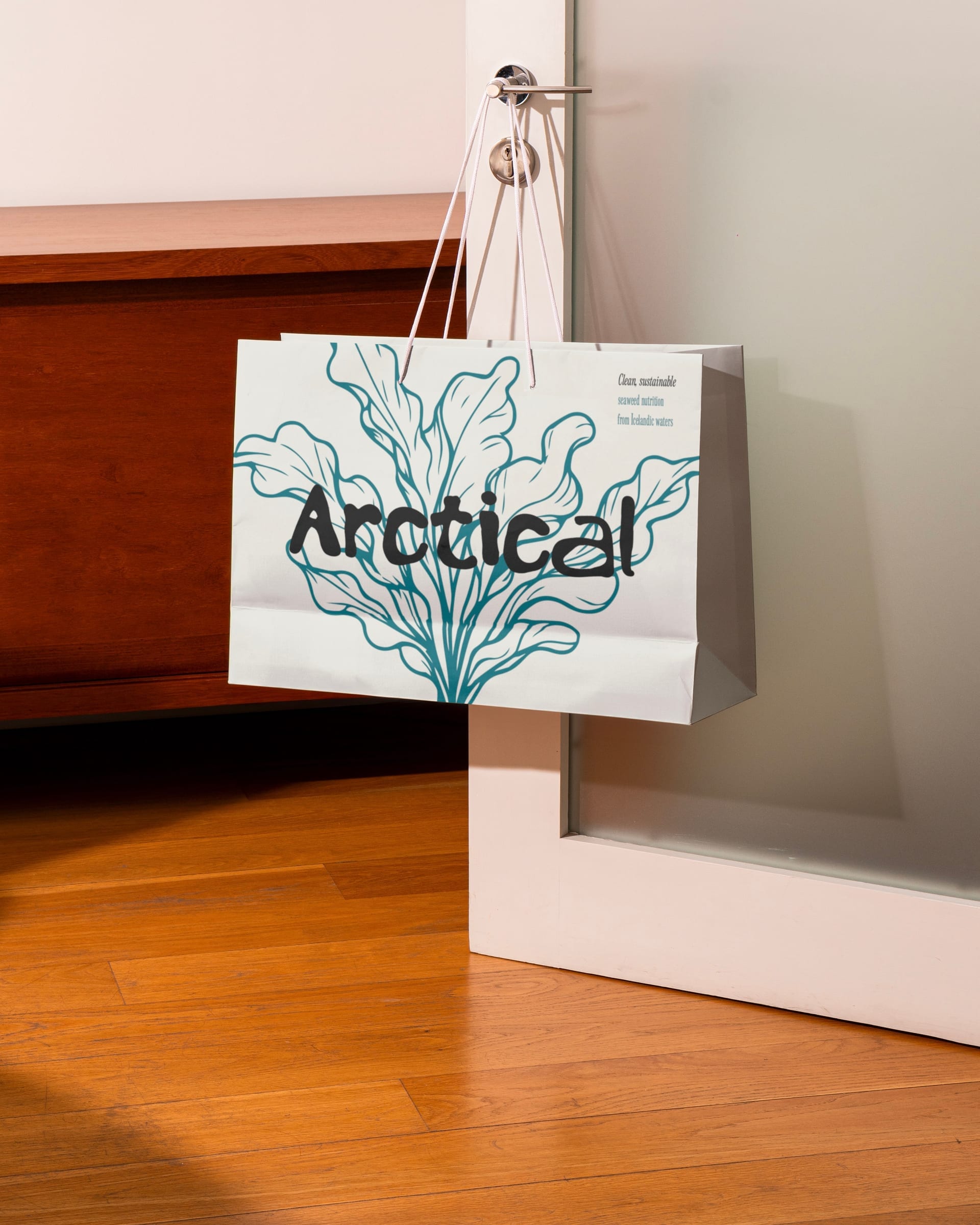
The redesign retains the relationship to Icelandic waters and the seaweed itself. That origin provides a consistent starting point for the brand's visual language.
A system across the range
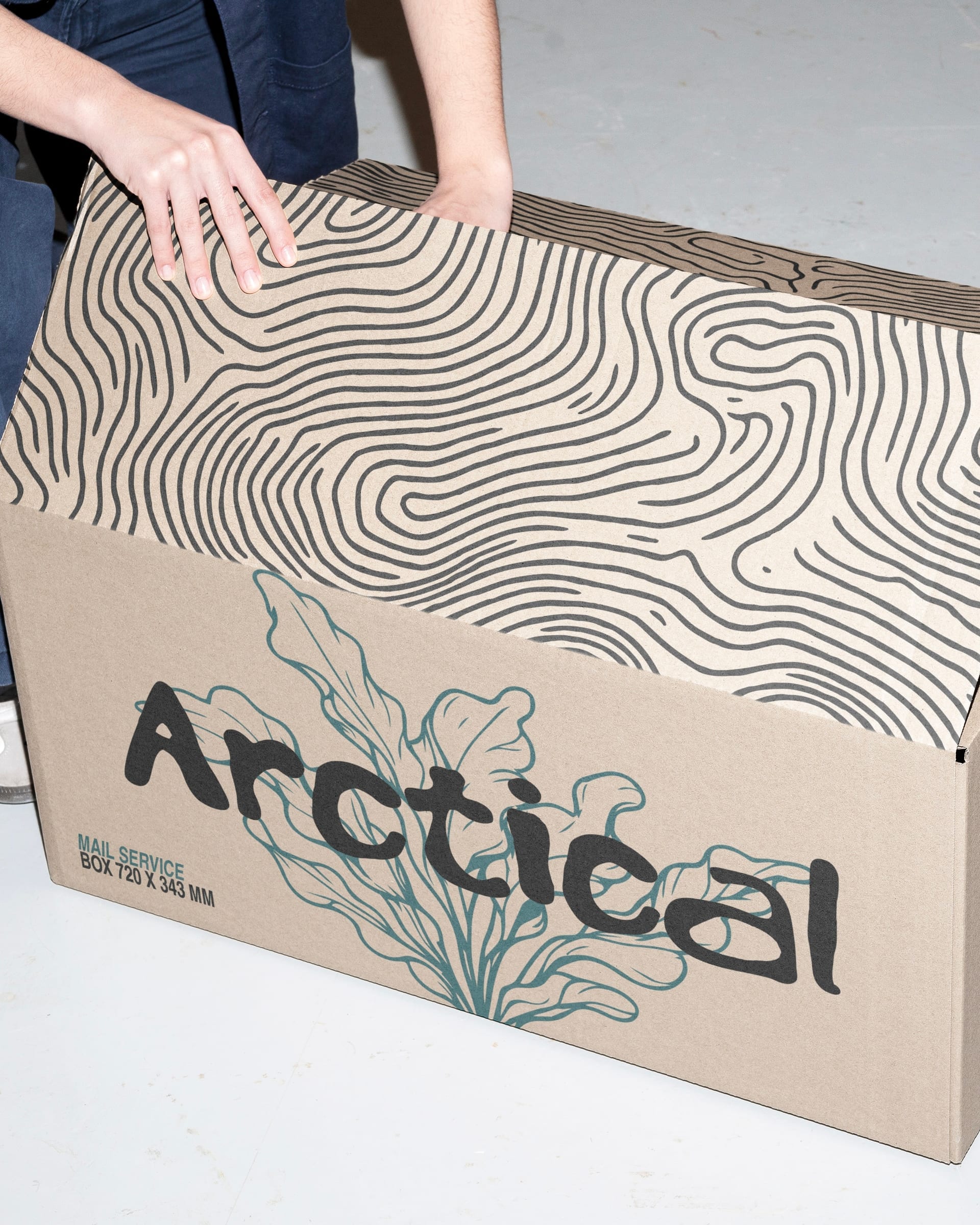
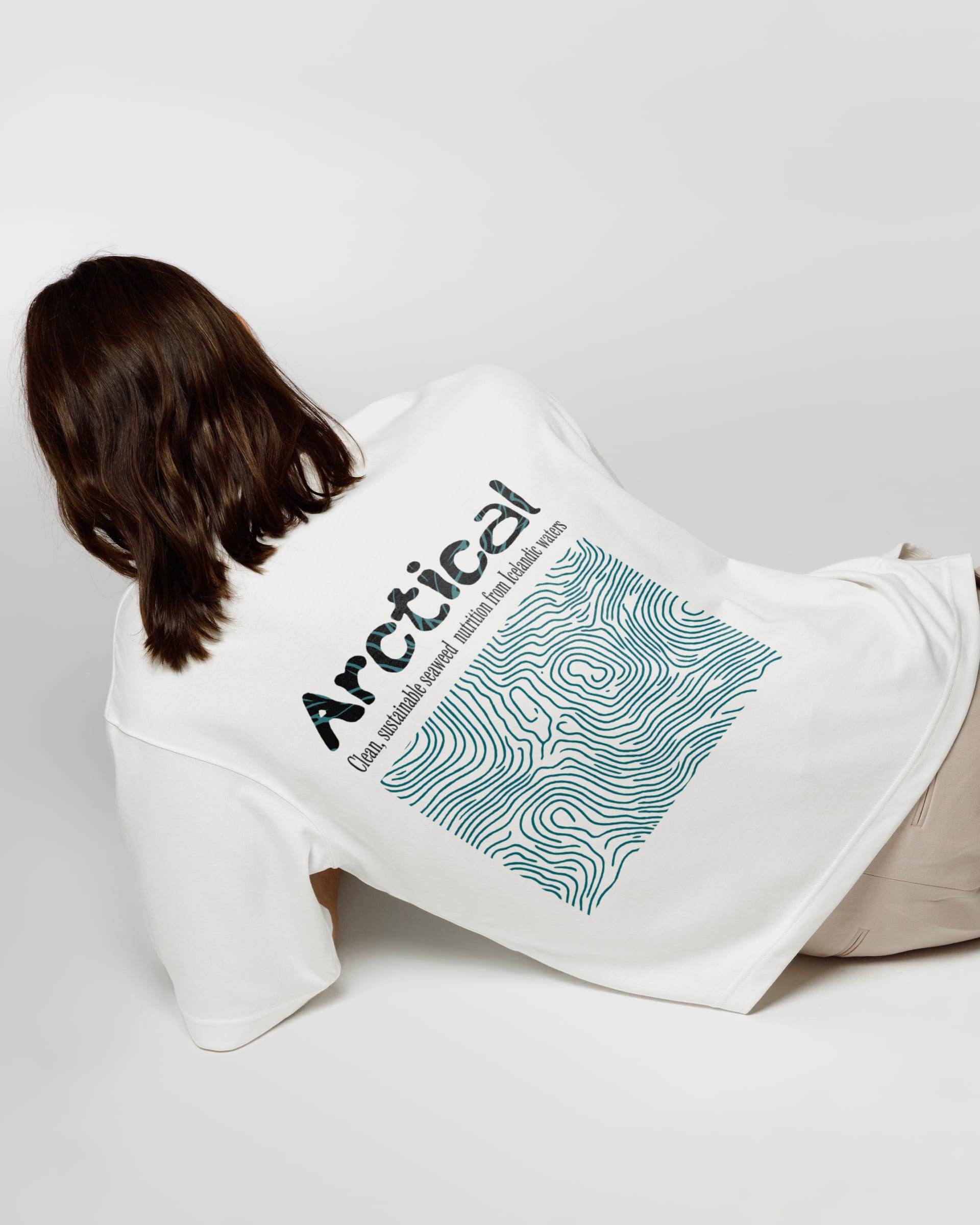
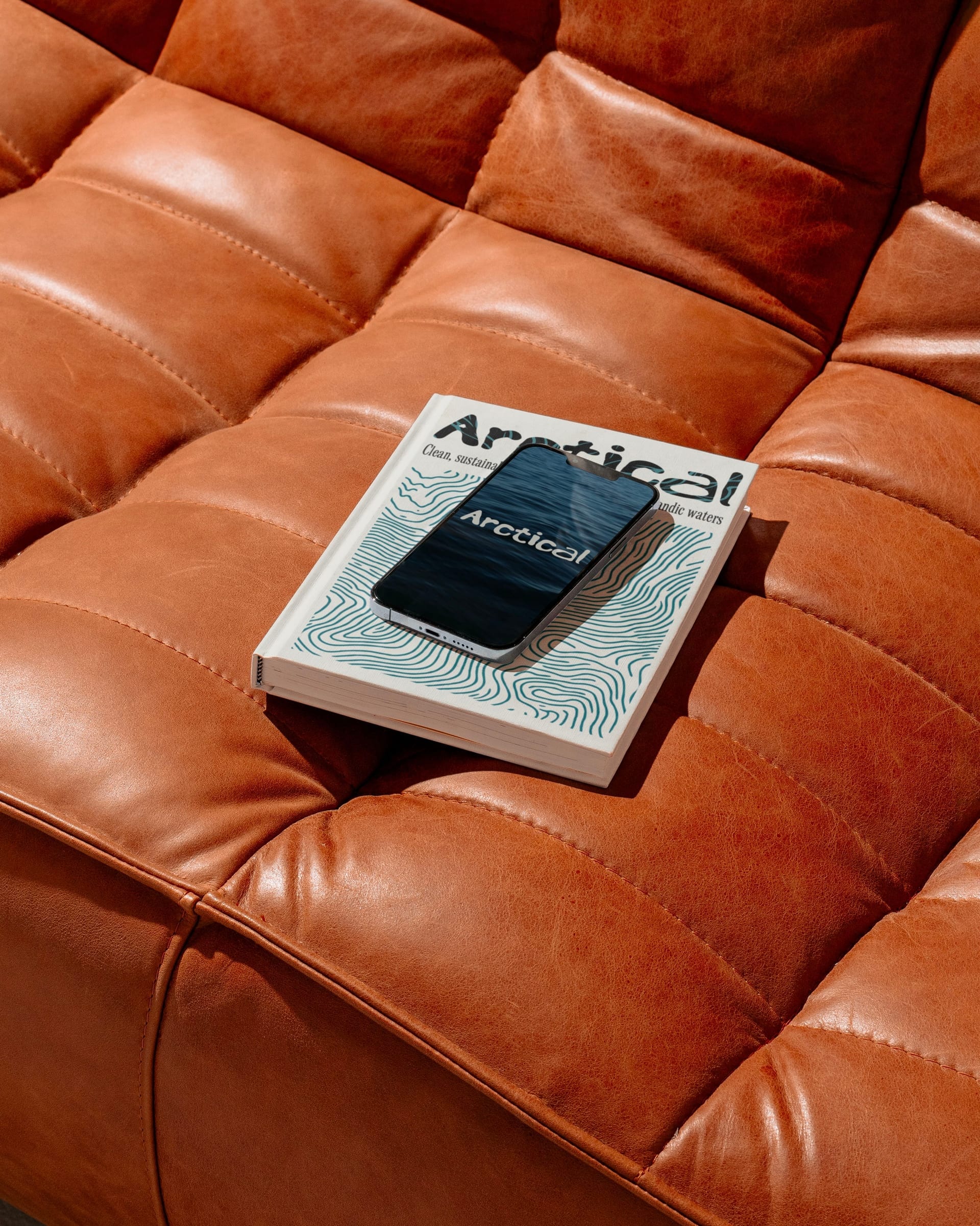
I brought packaging and digital applications into one visual structure, with typography, imagery, and layouts that can extend across the product line.